It’s that time of the year when we all start thinking about what planner we are going to be using over the next 12 months. You may have already got your planner for next year but you may also still be looking for one to get. So over the next few weeks I’m going to be sharing the planners that I have on hand and my thoughts on them. Plus loads of photos so that you can see exactly what it looks like and what you will get. I hope that this helps you in your 2016 planner search.
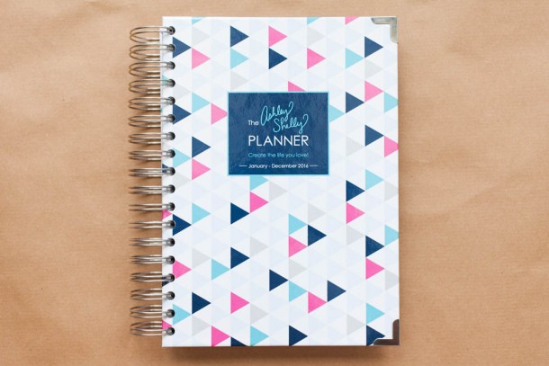
So here is this is the first planner that I have to share with you. This is the Ashley Shelley Planner so this is what is on the listing in the store:
The 2016 Ashley Shelly Planner is designed to help you create your very best days! There are a few extra special features that guide you through organizing and staying inspired throughout the entire year.
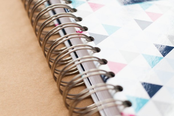
Here is a nice close up of the wire-o binding.
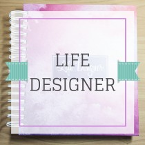
 The cover of this planner is a hard cover which I love the corners of the planner have been reinforced with metal and they have a lovely silver finish to them.
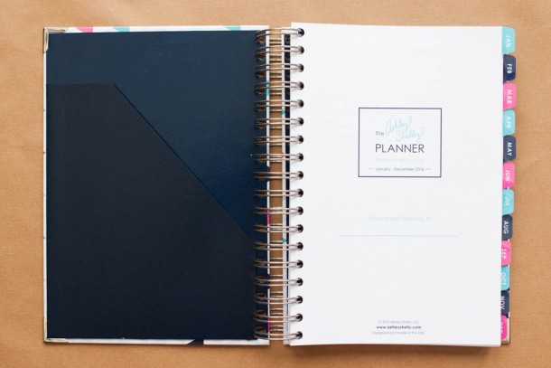 So when you first open up your planner you can see that there is a pocket on the back of the front cover and the Ashley Shelly logo. Here’s a close up.
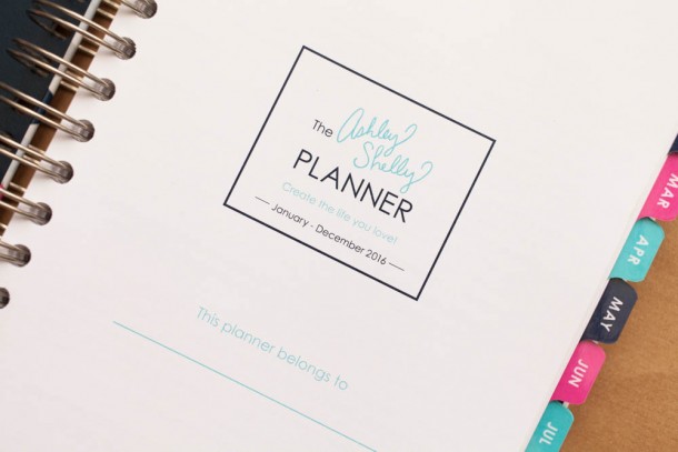 And you have somewhere to write you name and contact details just in case you lose your planner! As if that would ever happen!
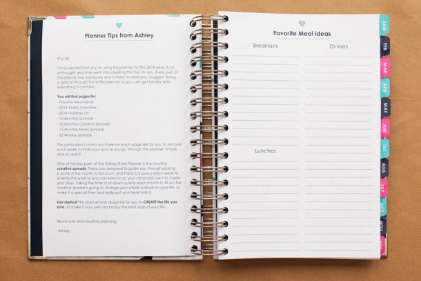 So getting into the planner. First off you get a nice welcome letter from Ashley and you also get a place to write go to breakfast, lunch and dinners. I think is an awesome idea because I suck at meal planning and we have a few easy got to recipes that we tend to use every week so they will defiantly get listed there.
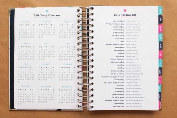 It’s always good to have a 2016 overview right up front I tend to use these for tracking when Jono is going to be in London or away at a conference or when I get to go away somewhere, either on holiday or to a conference. The list of holidays is a nice list of American holidays and this sheet is actually a bit thick then the paper as this is the tab for the month of January. One thing to note on this planner that I have not seen on any other planner and I think it is genius is the bottom right corner of the page.
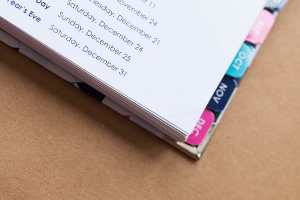 Can you see that little perforated tab! Genius! As you finish a page tear it off and you know where you are in your book, such a small thing but so clever! Laminated tabs? why yes please!
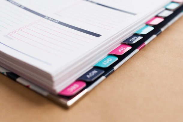 They are fab small but not so much that you miss the bold white text on them. I love the white text contrast on these, it really makes the color pop.
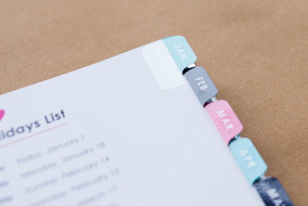 These tabs really aren’t going to get damaged! Let’s get into the month on two pages.
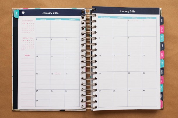 Very nice and clean layout not a huge amount of colour but still bright and fun. It’s a Sunday to Saturday layout and you get the month before and the month after shown in the top left corner.
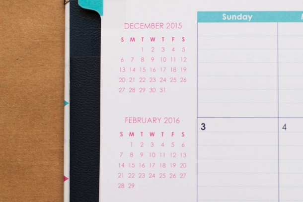 Always handy when your trying to figure out where about in the year you are and whats going on around you. As you can see the day boxes are lined which I love and feel that more planners should do this but that’s just my preference, purely because I don’t have the straightest handwriting.
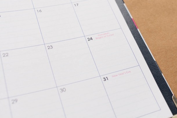 The holidays are also marked out on the month as well in a pink text but its not massively in your face its very subtle, and here you can see the lines again in the monthly boxes. LOVE THEM!
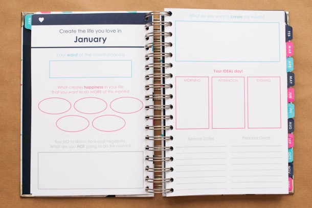 This is what makes this planner unique. Create your life. At the beginning of each month you have this spread to sit down and design the life you want. This is a great tool to get you to slow down and assess how you are going to control your life and get your goals done for this month, and also create your ideal day and how you would like things to go. I think this is a great idea to get you to sit for half an hour or an hour and really think about what you want out of life.
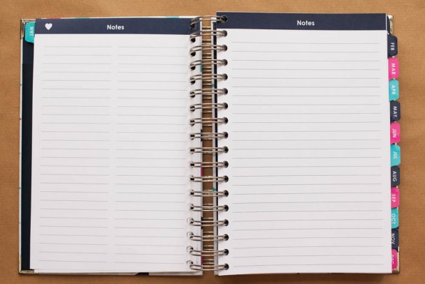 Turn the page and you get two note pages. The one on the left is divide into two columns now you could use this for a number of things. Shopping list, kids appointments, blog ideas, vacation days the possibilities are really limitless. The right page is just a full lined sheet ready for you to jot notes or track packages, maybe bulk out our blog ideas.
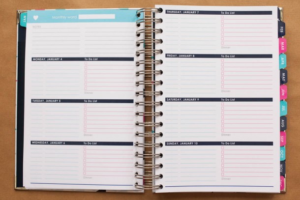 Next is your week at a glance and as you can see its a horizontal layout. This is something that I have been trying out for the past six months and I think I have got into the swing of things but we shall see. So in the top left corner you have your monthly word – remember from your create your life pages – this is to keep you on track for the coming week with a notes section under that. The days are split into to with the left for appointments or meeting and the right as your to do list with a line at the bottom for whats for dinner. Again a nice simply layout with subtle colors and not a lot in your face so that you can get down to designing your day.
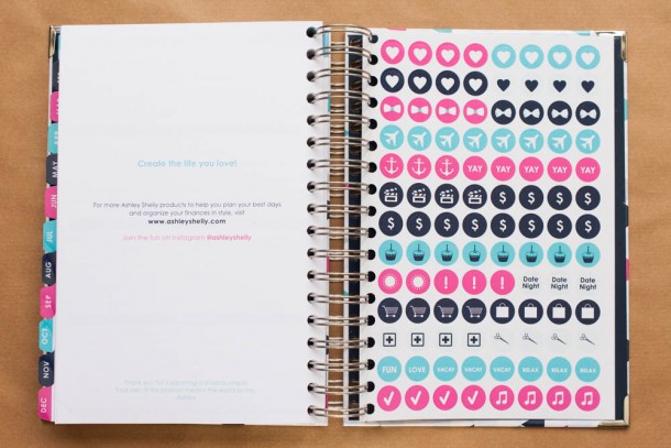 And when all is said and done and you get to the end of your planner and year don’t forget stickers! This is a great addition to the planner and instead of the plain label stickers that you normally get in some planners you have a variety of icons to use throughout your planner matching the colors.
This is a great planner and the company is small but growing – Ashley is lovely and you can see the care that she has put into this planner. So if you are looking for a hardback planner that is simply beautiful from start to finish with pops of colour through out this is the one for you! Let me know what you think about this planner? Is it the one for you?




Pingback: My Week 14 - Sam Simpson