You know me I love a new planner!
I fully admit to shiny planner syndrome! I have a weakness that my minimalist heart hates me for. But that is a goal for 2019 to try and stop the shiny planner syndrome. But while you are here I might as well show you this new planner from the guys at Scribbles That Matter.
You may remember the first Bullet Planner that the STM (Scribbles That Matter) came out with. And while this was a great first step into the planner market. It felt rushed and that it was trying to be too many things for too many people.
With a much more focused layout and thought process this one feels like the bullet planner that a lot of people were after! Not only is it much more portable at an A5 size. This has space for collections, not lots of collections but at least you have the space to do them.
So shall we get into this Navy beauty! I have a lot of notes and a lot of photos so best grab a cuppa!
The outside
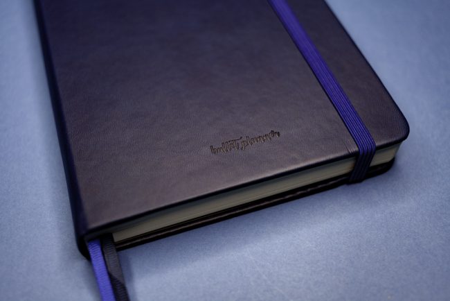
I have gotta say that STM have not compromised on the quality of this planner. It feels just as good in the hand as any other of their notebooks the cover is that lovely vegan leather feel!
On the front you have bullet planner embossed very small and not intrusive at all and on the back the company name. You still have the matching elastic closure, because no one wants pages flapping about. Also as standard have the two page markers and the pen loop has had a bit of a upgrade as well.
Rather then being glued in it is held in place by a silver rivet. Though I do wish that the pen loop was a little bigger. Purely because of pens with rubber gives are a nightmare to get in and out of it.
You also get a choice of three colours, I have the Navy (because it’s tardis blue) but you can also get White and Burgundy. There is no difference in the price between the three colours which is great. This retails for £22.99.
The inside
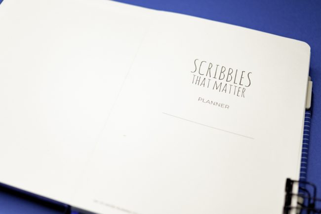
When you open the planner the title page is a little different to that of the notebook and the B5 Bullet Planner. As this is a dated planner you have a space to write you name or a email if lost which is great.
Yearly View
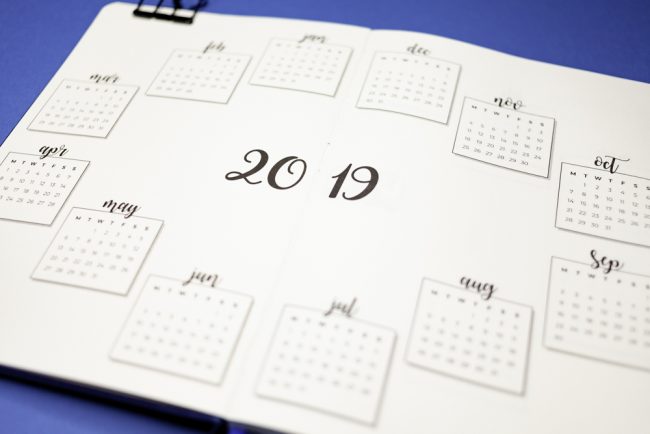
STM have not wasted any space in this planner! That normally very annoying page at the front, you know the one I mean. It has been fully utilised with a yearly-overview of 2019! You can see your entire year in one place. They also include 2020!
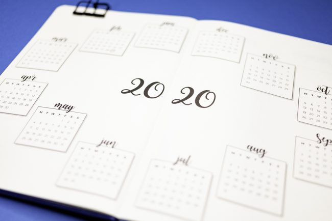
You know just in case you need to get some dates really pre planned! The paper is blank rather then filling it with dots you are free to do whatever you want with this page. Mine is going to be travel!
Future log
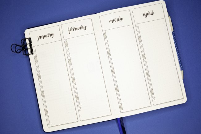
I was very excited to see that they have included this in the planner. This, for me, is a great place to schedule blogs posts and social media but again you could use this for anything.
Travel, moods, movie releases, spending or just as a future log. What is great about this as well is that the columns have dots in them as well so that you can write straight.
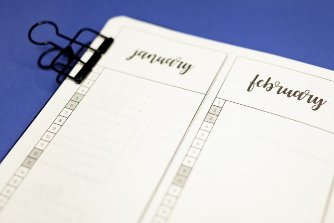
Another handy feature is that the weekends are greyed out. So that you can see where they fall without taking up space with the letter of the week.
Blank pages!
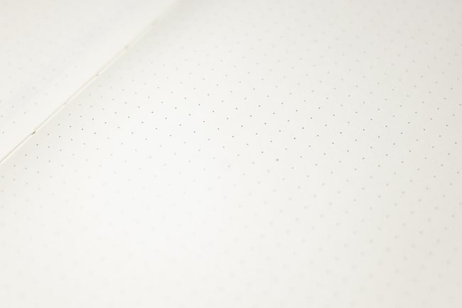
Yup you read that right! Before you even hit the weekly spread you get 16 blank pages and the absolute awesome part of this. It might be hard to see on this photo but there is a little cross in the centre of the page. 👀
This is a game changer for me as it means very little counting! Woo hoo! It really is these little details that make STM my go-to for notebooks now. Oh did I mention that the pages are still numbered. But no index, strange but you can use that page number as a reference on your weekly pages maybe…
Month set up
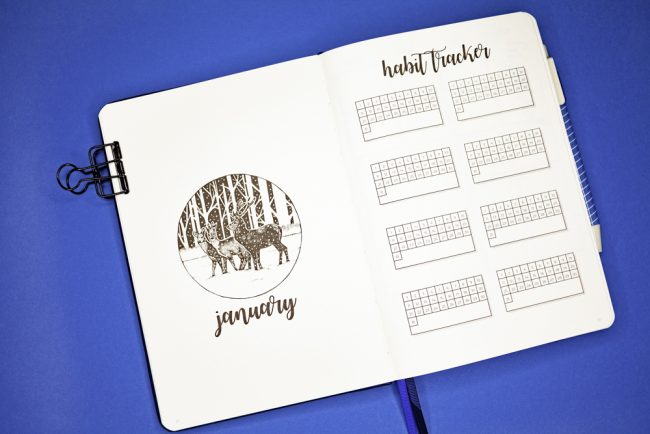
Each month starts with a cover page and a habit tracker page for 8 habits. These are tailored to each month so February has 28 days on its habit tracker page.
Personally I don’t care for the cover pages however I did see an idea on Pinterest that I may have to try for my cover pages. The habit tracker however I will use that!
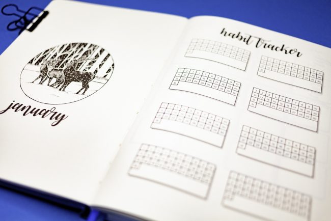
Each little tracker has enough room for me to do some fancy lettering. Fingers crossed for that set of brush pens on my wish list.
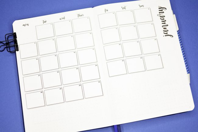
Following the cover and habit page you have the month on two pages. Which I always love in a planner. Under the month is dotted paper so that you either draw in or add extra trackers. Or whatever you would like.
Weekly spreads
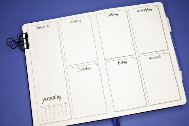
The weekly spread is a great blank slate to start your week and you have a running to do list on the left. My one complaint about this layout is that that weekend is in one box.
This seems to be a running theme with a lot of planners that the weekend just doesn’t have enough space. I work through the week and my daily to do list will fit in those boxes. However, I tend to so a lot on a weekend so my weekend to do tends to be a bit longer. I may need to have a think about how I tackle this. Hmmmm?
Other features on the page are in the bottom left corner you have a month view at the bottom with the week that you are in bold.
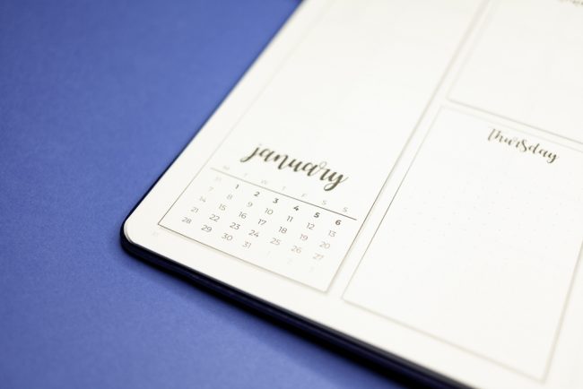
Between each month however you will find a blank spread which is great for setting up some pages for either the month ahead of review the month prior. Or this could be for your budget or memory page. It’s up to you really.
Back of the planner
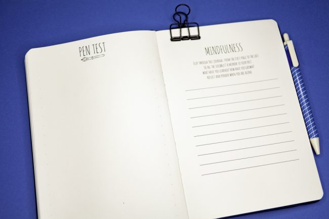
After the 12 monthly set up you have a further 16 more blank dotted pages in the end (because they are awesome and listen to their fan base). You then get the signature pen test page and the mindfulness page to review you year.
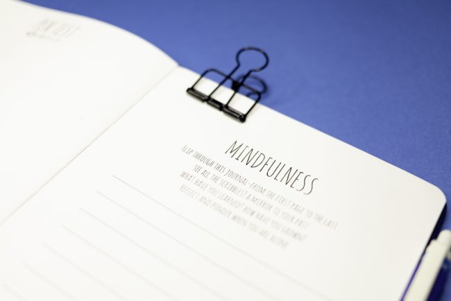
I like this feature as it gives you a chance to look through your planner and see what you got up to in the year and plan for the upcoming year.
My final thoughts
All in all this is a great follow up to the B5 Bullet Planner. The A5 size is going to appeal to a lot more people and even though there are 40 more page it doesn’t feel any bigger then the standard notebook. .It has the same quality paper, ya know that 100 gsm buttery goodness. This is something that I and a lot of people really love about these notebooks. You are not going to get a lot of bleed on the pages.
Use of space feels a lot better! For people who have small daily to do lists and don’t want to have to draw out a weekly layout. This is going to be perfect and is going to fast become my go to recommendation for beginners.
For me I may need to have a think about how I use the pages as I am a huge list make, aren’t we all! But I may need to have a companion notebook for conference notes and travel logistics.
Like I said before this feels very nice in the hand and looks very professional. If you were to get a companion note book you could get the pro version so that they match. Personal I will be going for the Iconic as I love that cover and it will be a great distinction between them.
Overall this is a really nice starter journal and gives some nice structure with out being to confining and the fact that is it dated is great as well. I would definitely recommend if you are wanting to dip your toe into the world of bullet journaling.
What do you think of this new Bullet Planner from STM? Will you be grabbing one? Which colour would you go for?
Until next time!





Thanks for the overview! I was on the fence and wantwa sure the price was worth it just being another planetp. think I will actually go this route next year.